Machine Learning: Side Note - Iteratively Improving our model
To break the fourth wall a bit, in building up the interactive demo, I’ve realized some changes I’d make to the model here.
This blog post will dive into my thought process for improving the model in couple of different directions.
Average loss per sample vs Total loss
To get the loss for the model, we’re currently summing the per-sample loss. The major downside of this approach is that it makes it impossible to compare two models that were trained on different numbers of samples. This is because each sample contributes some loss to the outcome so more samples will necessarily imply a higher loss. To fix this, I’ll switch to averaging the loss across the samples to quantify the quality of the model. This will mean that even if we add more data to the model, we will still have a way to compare apples to apples whether the model is actually getting better with the additional data.
Here's the demo with an additional row for average loss:
After adding the average loss per sample, my first thought is that it's hard to tell that anything is better or different compared to before. The number is smaller than before but we don't actually care about the value of the loss as much as that were minimizing it. So why is this better? In order to demonstrate that this is better we need to demonstrate that, previously, as you would add more data, the sum loss scales up even when the quality of the model isn't any worse. So I decided it would be useful to add more data on the fly to see how the loss is affected in the two cases. This should better demonstrate the problem. In the demo below the plus button next to “Samples” doubles the existing samples. Click it and see if you notice what happens with the Total loss and the average loss respectively:
Since we’re just doubling our existing data, we’d expect our model to perform just as well, no? What we see though is that when we add the same data again, sum loss doubles as well, which means it’s not a useful tool for comparing models with different amounts of data.
After using this example, my next thought to improve this model would be to support uploading a CSV file of data to the model and thus the cycle repeats!
Proportional vs Fixed Gradient Descent Step Size
When the loss is really high, you can use a large step size but as the loss approaches zero, those higher step sizes are unstable and dance around without making a lot of progress. (See figure 1 below for an example)
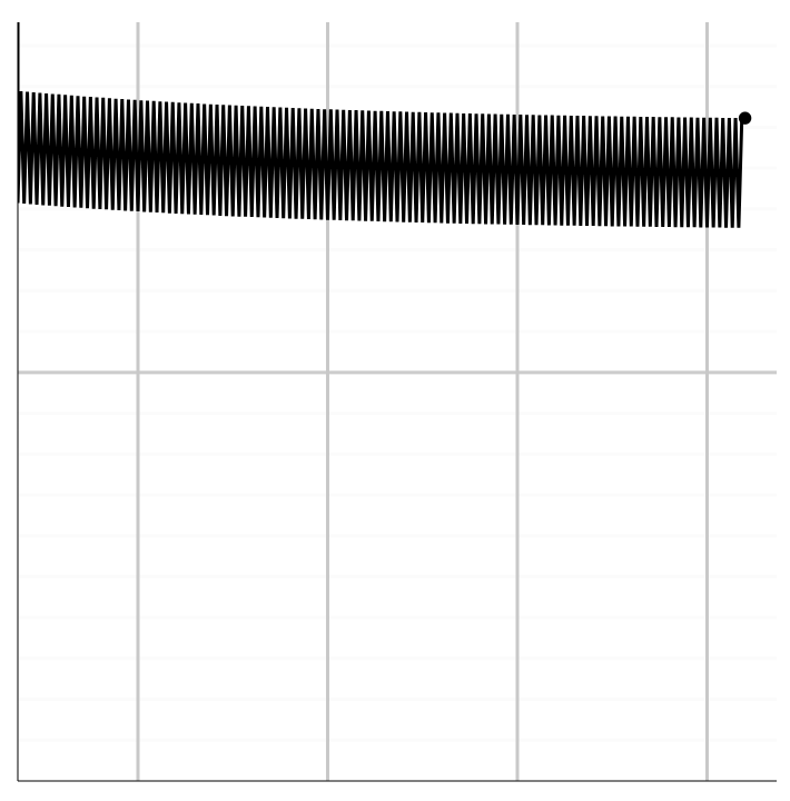
Figure 1: Example of a model that has a lot of variation but not a lot of improvement.
It would be good if we could use an adaptive step size that is aware of how large the current loss is and picks a step size accordingly. Let’s do that. In the demo below, we’ve added a toggle to enable proportional step size when doing gradient descent. Play around with the model below and see if you notice any patterns/differences between when the model uses proportional step sizes vs a fixed step size.
We've added the ability to configure whether the model should use the proportional step size but this still isn't quite enough to get the insights were looking for. I don't know about you but for me it's almost impossible to tell which one of these model it doing a better job training on the provided data. It would be useful if we could compare two runs side by side. I've added the ability to save a run of the model. After adding this we can see that although the fixed step size learns faster, it becomes unstable at end.
Try running the model below with a large step size until you notice it level off. Then pause the model save the run and reset. Now turn on proportional step size and compare the two runs. Do you notice anything about the two runs?
The next thing I might do to take this line of improvement even farther is highlight the runs in different colors so that it's easier to tell one from the other and see what the settings were for each run.
Learn - Visualize - Repeat
The meta takeaway is that this process can be quite imprecise. It's a continual cycle of producing new visualizations which provide new insights which in turn inspire ideas for new visualizations.
So with that I’ll say, go forth and iterate!