Machine Learning: Chapter 6 - An enhanced demo
This blog post is going to be slightly lighter. It’s going to walk through an expanded version of the interactive demos we’ve been working with. It will give us a more complete picture of what’s really going on. Importantly, it puts the training examples front and center. The extensions also make it easier to notice small improvements in the model.
As always, let’s start off where we left off last time:
The new version is going to include the data that we’re using to train the model so let’s first move the names over to the side so that they’re all in a row.
Next, let’s add the samples:
Admittedly, this table can be hard to parse. Basically, each column in this section of the table is one day and the rows are the corresponding values for each of the predictors for that day. Phew that was a mouthful but let’s look at an example:
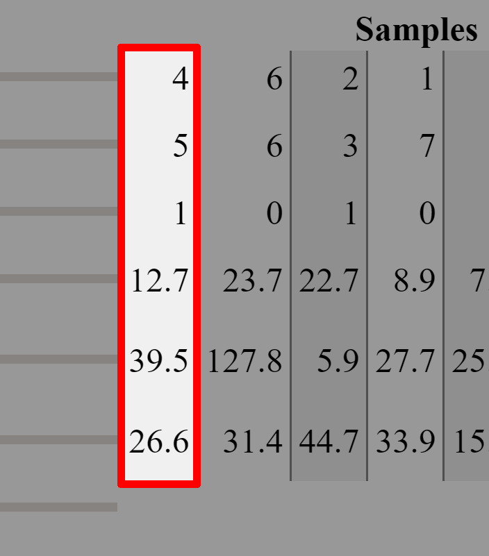
The column that we’ve highlighted represents one day where I drank 4 espressos, slept for 5 hours, went to the gym, ate around 13, 40 and 27 grams of protein, carbs and fat respectively for breakfast.
If you recall from the previous blog post, this was the example we used when calculating the gradient:
So you can think of each one of the columns in the “Samples“ section as one vector of predictors.
One important thing to notice is the bias row. We give it a slider because it’s one of the model’s parameters. But it doesn’t correspond to any particular piece of input data (e.g. how long you slept). That’s why there’s no data in its row.
Finally, we’ll add a section of the table to show our model’s loss:
The first row has the “labels” that are matched to the corresponding input parameters. (i.e. the observed productivity on the day) The next row is our models prediction for each one of the samples. The third row has the loss for that particular sample. (Remember that we are squaring the difference!) Finally, the last row is the sum of all the losses, giving us an indication of the overall quality of the model.
(Note: to keep the table somewhat manageable, we’re rounding the numbers so sometimes it’ll say that the loss is 0 when it’s really just quite small.)
Try playing around with the sliders and running the model for a little while. I also recommend playing around with the step size slider.
Some questions that come to my mind are:
What happens if you start training a model from a particularly bad starting position (the sliders all the way to one side)?
Is there one step size that always works the best?
How low can you get the loss? (My best is 1.199, can you beat that?!)
Once you’ve trained it for a while, can you improve the model manually?
In the next post, I’m planning to extend this demo to introduce non-linearity and see how having multiple layers affects the math of gradient descent.